Thursday, January 30, 2020

Expediting the Results

Let’s say you want to make a drawing of a place that you’ve never been. Sure, you could play it easy and browse similar looking images on the web, download them, print them off, slip-sheet them and get cracking. Or...you could go the traditional route and actually seek out and photograph similar looking places, print off the pics and run them through an Artograph.

The problem with sticking to the internet is that it’s common. Everybody has seen and downloaded those same images. It’s called playing it safe, and playing it safe sucks, and if you’re a college student, you really should know better.

Illustration is an expensive hobby. Having a few French curves, a T-square, a drafting table, some pencils and some tracing paper is a good place to start, but before you know it, you realize that what you really need...is a camera. A real camera. One capable of taking iconic photos. In other words photos that are not of someone standing in front of a mirror.

And there’s a lot of leg work involved in this game called commercial art. It’s not just a matter of making a drawing and turning it into a painting. If your Leonardo DaVinci, you can do that, but the rest of us have a much finer line to walk. And sometimes you don’t have the time to do it the traditional way. Sometimes you need to produce results and produce them fast!

Mouse Guard illustrator and author David Petersen is a classic example here. Petersen makes a small mock-up of what he wants to draw, photographs it, prints it off and turns it into an environment fit for the project. Using foamcore board, Styrofoam, cardboard, found items and polystyrene model parts, Petersen can create the backdrop for any scene he needs. All he needs to start is a quick sketch or two.

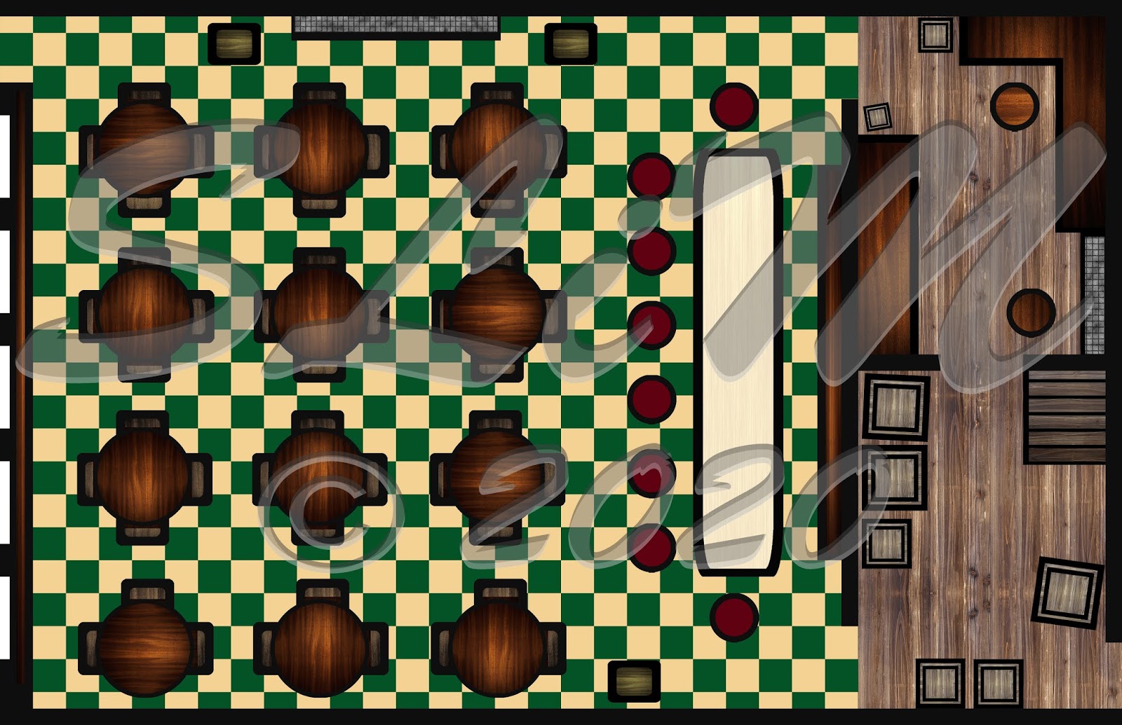
Here I have designed a floor plan of sorts for something I want to build myself. I have no idea how to do things to scale in Adobe Photoshop, so I just sort of used my imagination. This is mostly Custom Shape Tool and Rectangular Marquee. The textures are courtesy of Gettyimages. 

I think I did okay here. I mean, the tiled floor is sort of busy, and the textures for all the tables and chairs, etc. could be a little lighter. There’s always room for improvement, I suppose, but at least I can say I have a blueprint for something i want to build. Yes it’s a tavern. Thanks.

SLiM

All Images are Copyright © Stephen L. Morris 2020 All Rights Reserved.


Saturday, January 18, 2020

The Word Glorified Gets Thrown Around a Lot

From illustrator to glorified turd polisher. Or so it seems. When I struggle with drawing, it’s usually because I’m doing it the wrong way. In other words I’m relying on memory, what I remember about drawing and design in those 8 years of college (part time), instead of working from photo scrap, as one of my illustration teachers calls it. But any progress, theoretically, is still progress.

Yet I see the results I make, and I catch myself thinking “oh no problem! I can clean this up in Adobe Photoshop in a jiff!” The problem with that is the drawing never gets improved upon. But maybe I should begin from the beginning.

You see, back in 2004, I’d had an idea for an ink drawing that I wanted to do for my dad’s birthday. My dad and I share a love and passion for heroic and mythic fantasy, specifically, author Robert E. Howard’s Conan. It’s a common interest that began, ironically with the 1982 Arnold Schwarzenegger film.

Anyway, back in 2004, I had barely two years worth of college so in class I did the best I could with drawing “the right way.” I had originally learned from memory, and relied on it to create this humorous, if not somewhat dark caricaturing of my father and myself re-imagined as R.E. Howard-esque barbarians.

I figure the reason I didn’t do the drawing the way I had learned it in college was due to the fact that the project required cartooning, something I was interested in, but was learning illustration and graphic design instead. This is a decision that has continued to haunt me throughout my career (LOL!) as an artist. I often think I should have at least learned the basics, but everything happens for a reason.

Getting to the other image, this triadic is from a sloppy rushed ink drawing I did in 2013. I cleaned it up in, you guessed it, Adobe Photoshop (aren’t you surprised?) and added some colors, but in the immortal words of special effects artist and Face Off contestant Roy Wooley, “it’s hard to polish a turd.”

Although I kind of like it. So there you have it, folk(s). Cartoon barbarians. I hope Sergio Aragonés doesn’t sue me for copyright infringement! I kid. I kid. Although anything is possible. Kidding.
Happy Arting. 


SLiM

All Images © Stephen L Morris 2020


Thursday, January 16, 2020

Cute and Creepy! ^ . ^


Let’s face it. I pretty much suck at social media. But that’s no excuse to go so long (last post was in May) without blogging. So here goes. . .

2019 was a brutal year for me and my family. There were a handful of deaths in the family, and someone very close to me had a stroke! Yeah. Needless to say, I’ve got my fingers crossed that 2020’s going to turn out infinitesimally better. 

But not all of 2019 was negative. From the creativity point of view, I continued laboring over my tabletop roleplaying game, which I hope to finish in 2020 (vanilla expansion, etc. Whatever they call it. I’m old. LOL). However, I also sat on my arse a lot, so. . .

Anyway, I’m proud….no. I’m grateful. Grateful to be finished with a design I’d hoped to finish last year. I like ‘im. Love 'im, actually. 

He's that all-too-popular mixture of cute/creepy, and though I detest pretty much all things popular (except for Guardians of the Galaxy, Shazam, New Voltron and some other stuffs), I really dig the way this turned out, I must say. 

It's an owl. Forgot to mention that. Well, maybe it's not an owl, per se, but an apparition that assumes the form of an owl. Or it's an apparition of an owl. Your choice, peeps.  Also included a progress...progressy...thing. 

On the progression...thing...there is a difference between every single rendering. Trust me. (Shyeah, right!) 6 has only one line, in addition to 5. I made symmetrical the nose. Sorry for the watermarks (not sorry, actually), but what’s mine is not yours...at least not until I put it on a product and sell it. 😉 Tootles. And enjoy cut/creepy. By for now. Next post is in 2021!! Kidding. Kidding.

SLiM

All images (below) © Stephen L Morris 2020